Tight & Bright
The ask
Space and space planning were the biggest challenges with this redesign. We’re big believers in quality over quantity and this design certainly pushed that philosophy to the edge.
The Solution
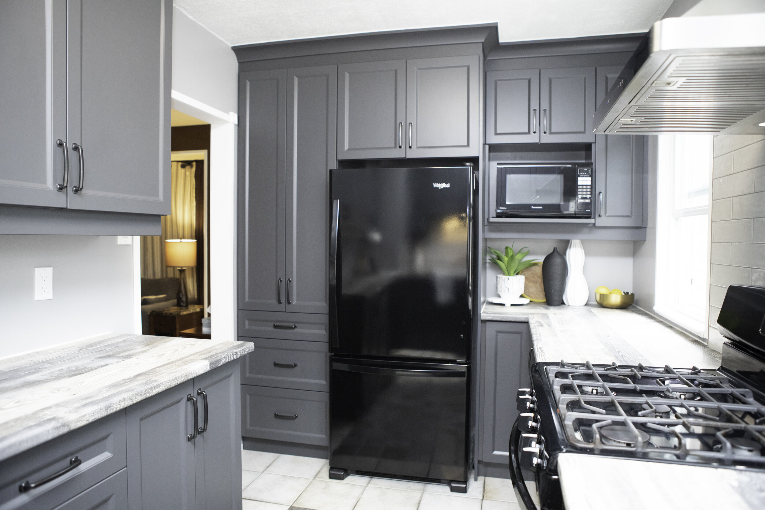
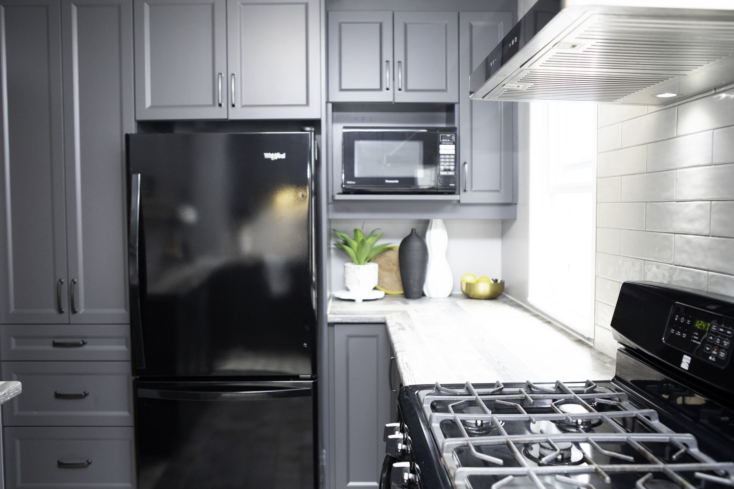
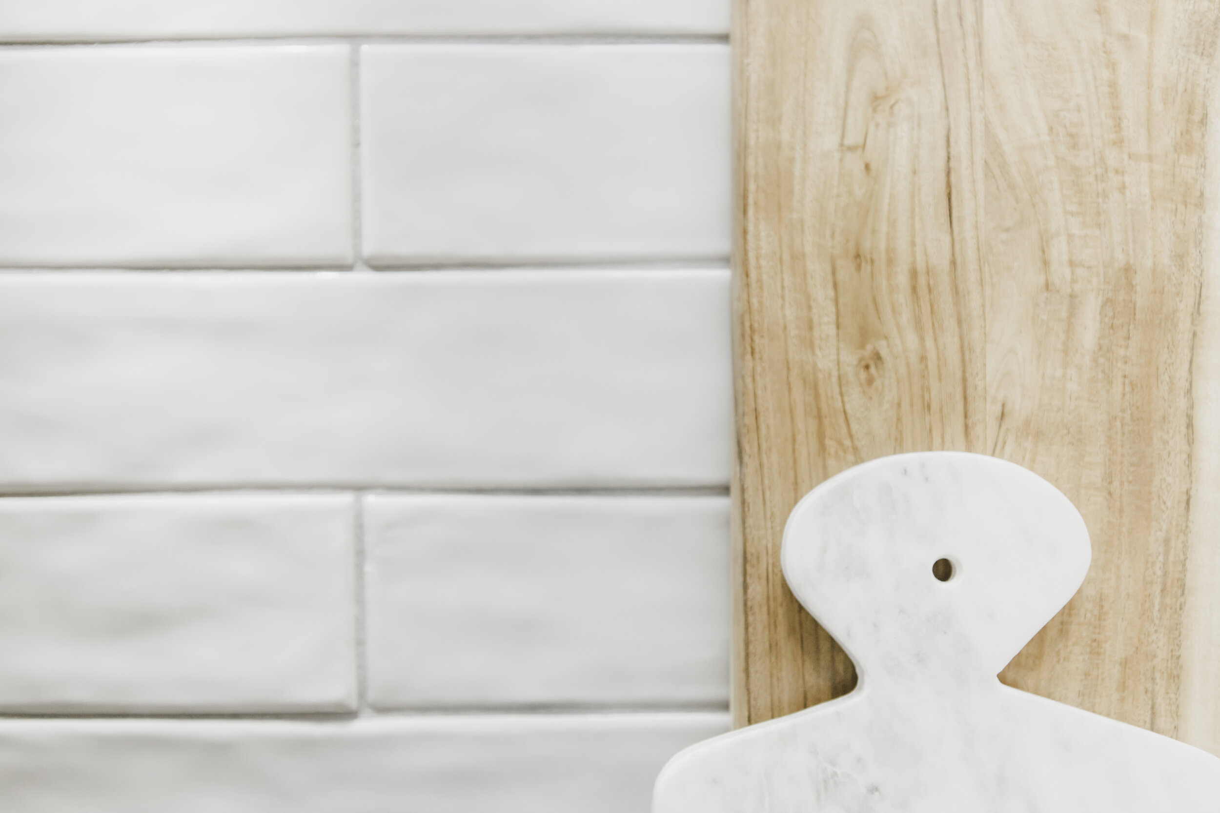
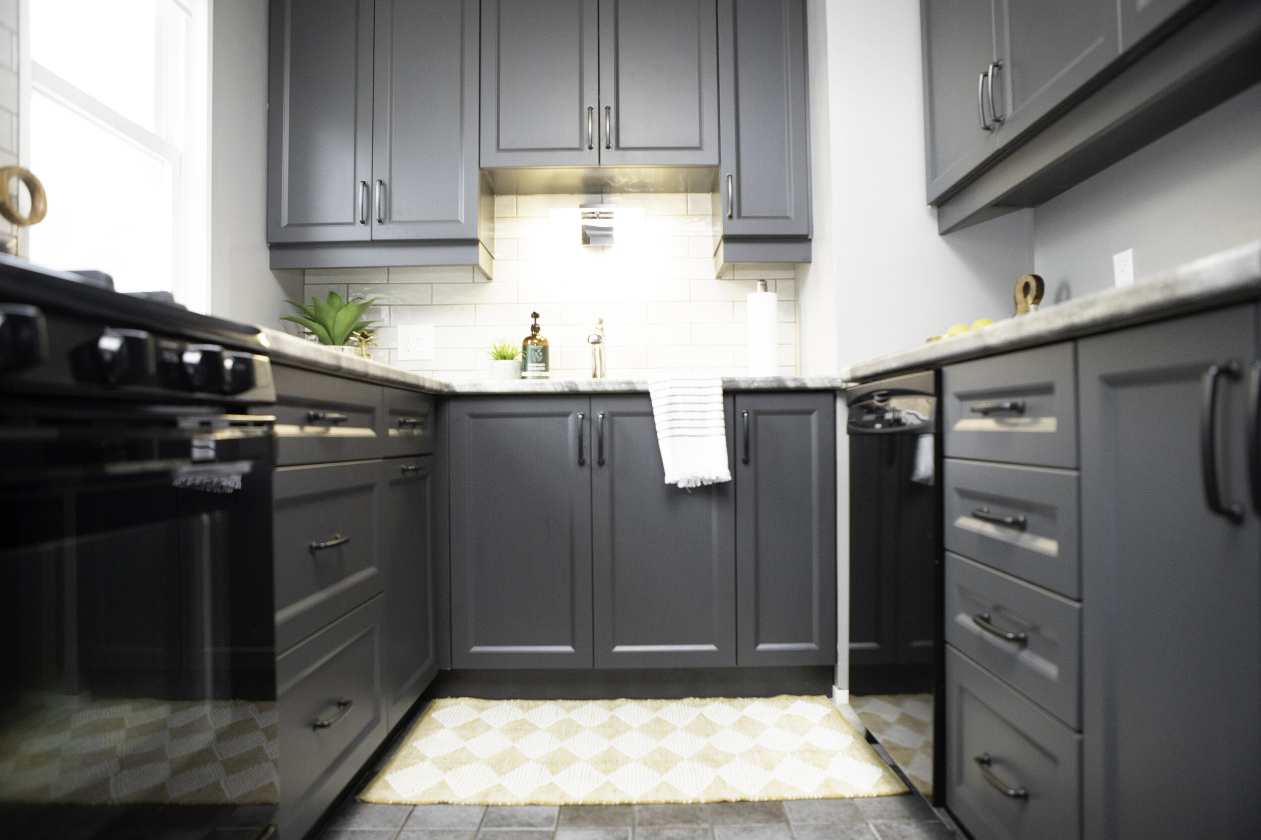
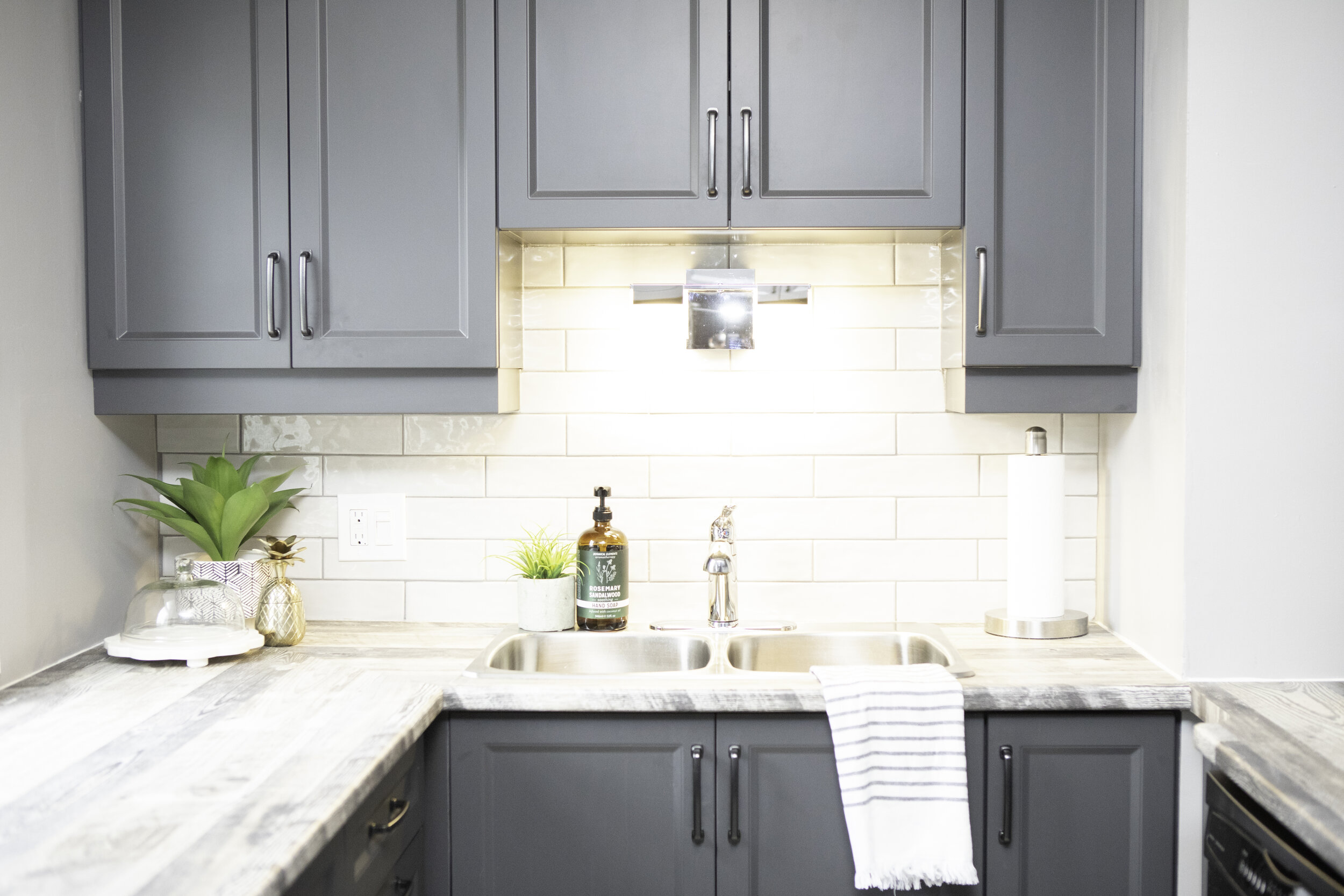
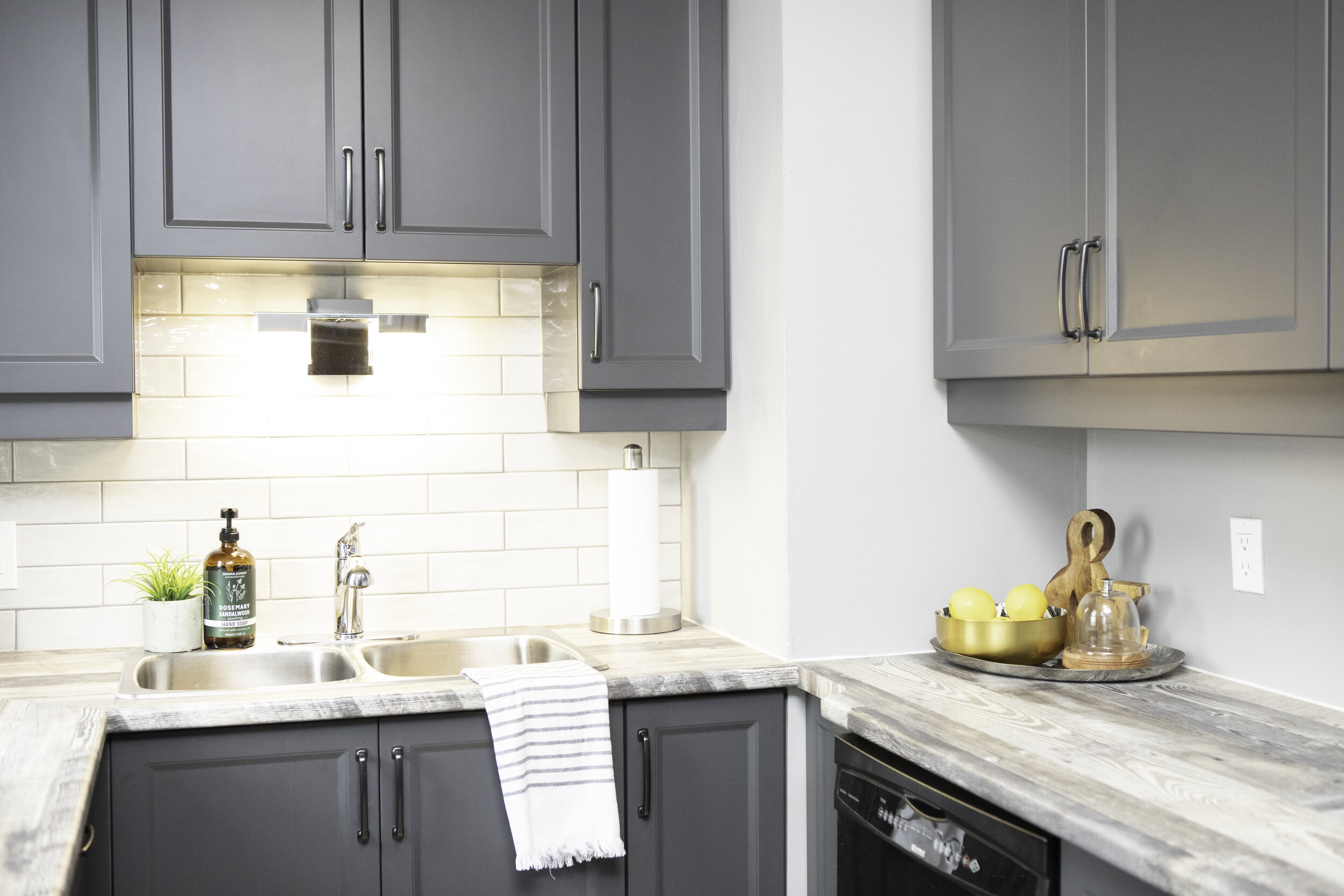
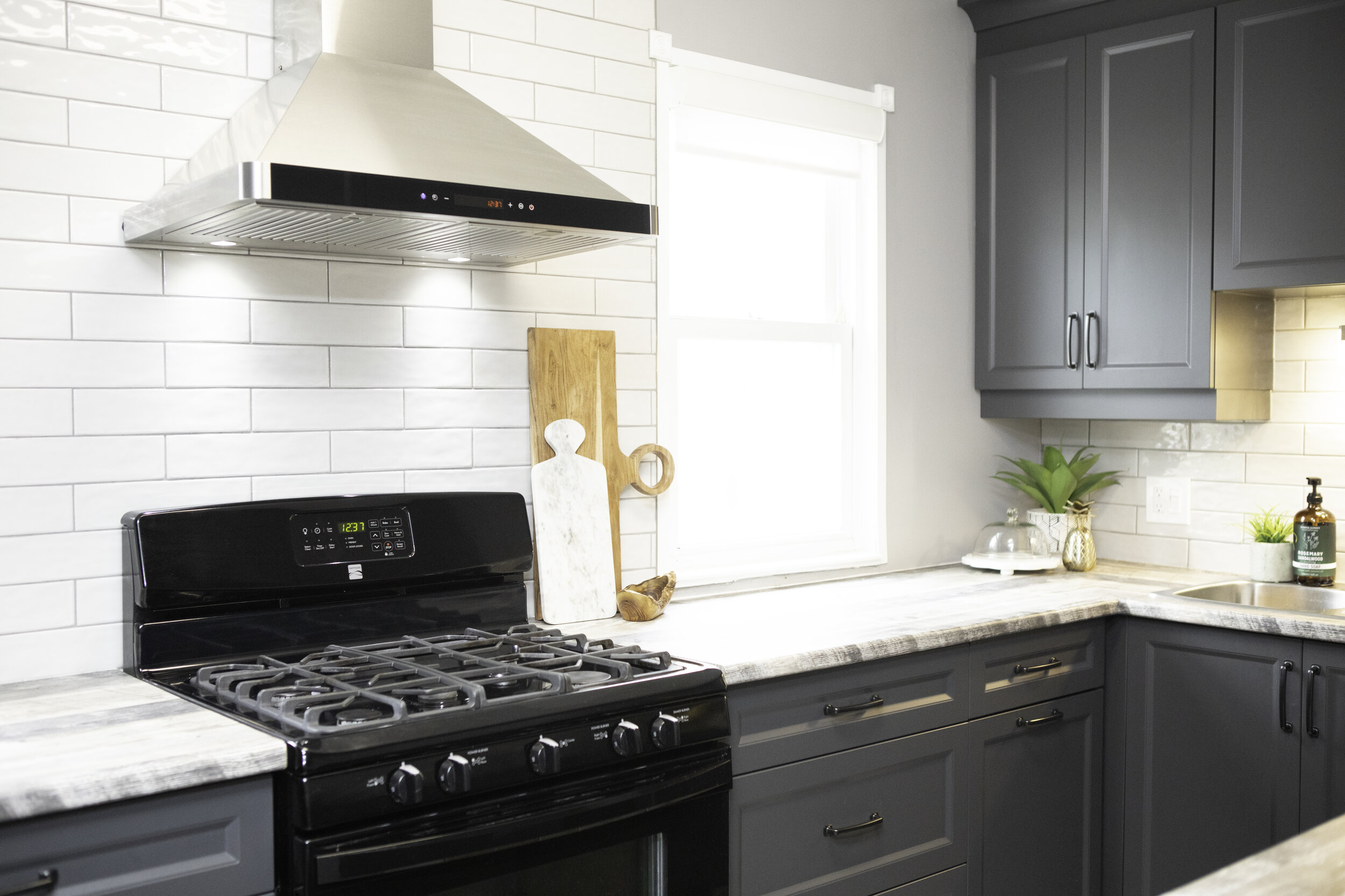

One of the tightest spaces we’ve worked in but, without a doubt, one of the ones we’re most proud of! We were able to get so much effective storage by reworking the layout and adding more drawers. We also went dark and moody on the cabinetry, but kept the space open and bright by letting the stove be the center of attention by framing it with windows.
Photography - Expressions Photography
